Note
Click here to download the full example code
Clustering players
In this tutorial we show how to cluster players to positions using their statistics. We will use a dataset provided by Ronan Manning with statistics for everty top 5 leagues player, which is available here. This tutorial is inspired by John Muller’s article on The Athletic Introducing The Athletics 18 player roles.
#importing necessary libraries
import pandas as pd
import numpy as np
import warnings
import matplotlib.pyplot as plt
from mplsoccer import Pitch
import os
import pathlib
import json

pd.options.mode.chained_assignment = None
warnings.filterwarnings('ignore')
os.environ['TF_CPP_MIN_LOG_LEVEL'] = '3'
np.random.seed(4)
Preparing the dataset
We open the data and change minutes played to integers. Then, we keep ony players who played more than 500 minutes. As the next step, we convert all data to numeric format and replace NaN with 0. Last but not least, we keep only columns with player statistics.
#open data
data = pd.read_csv("data.csv")
#change minutes to numerics
data["Min"] = data["Min"].apply(lambda x: x.replace(",", "")).astype(int)

data = data.loc[data["Min"] > 500]
data = data.reset_index(drop = True)
data = data._convert(numeric=True)
data = data.fillna(0)
X = data.iloc[:, 11:]
Dimensionality reduction
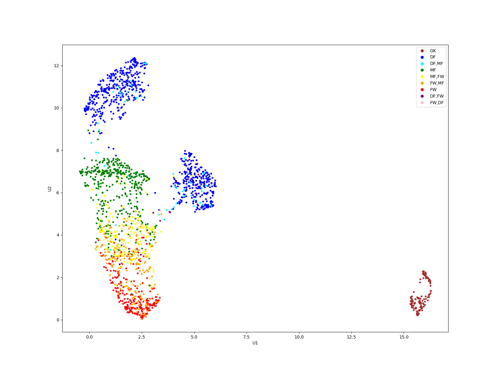
Since we have over 100 features, it is important to reduce the dimensionality. First standard scaling is applied to data. Then, we use UMAP algorithm, as in John Muller’s article, to reduce the dimensions to 2. As the next step we plot the data with formation label available in the dataset.
from umap import UMAP
from sklearn.preprocessing import StandardScaler
#scale data
scaler = StandardScaler()
X = scaler.fit_transform(X)
#dim reduction
reducer = UMAP(random_state = 2213)
comps = reducer.fit_transform(X)

#plotting
fig, ax = plt.subplots(figsize = (16,12))
#map position to color
colors = {"GK": "brown", "DF": "blue", "DF,MF": "aqua", "MF": "green", "MF,FW": "yellow", "FW,MF": "orange", "FW": "red", 'DF,FW': "purple", 'FW,DF': "pink"}
color_list = data.Pos.map(colors).to_list()

#plot it
for i in range(X.shape[0]):
    ax.scatter(comps[i,0], comps[i,1], c = color_list[i], s = 10)
ax.set_xlabel('U1')
ax.set_ylabel('U2')
#make legend
markers = [plt.Line2D([0,0],[0,0],color=color, marker='o', linestyle='') for color in colors.values()]
ax.legend(markers, colors.keys(), numpoints=1)
plt.show()
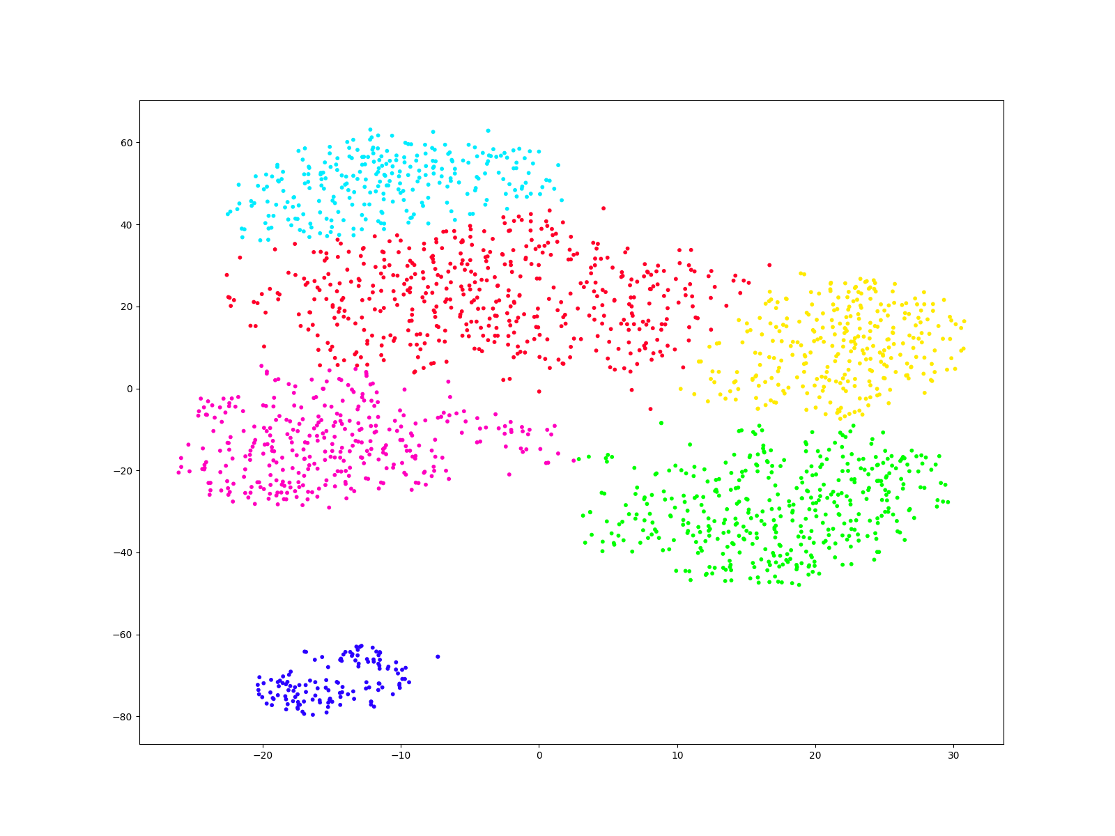
Clustering
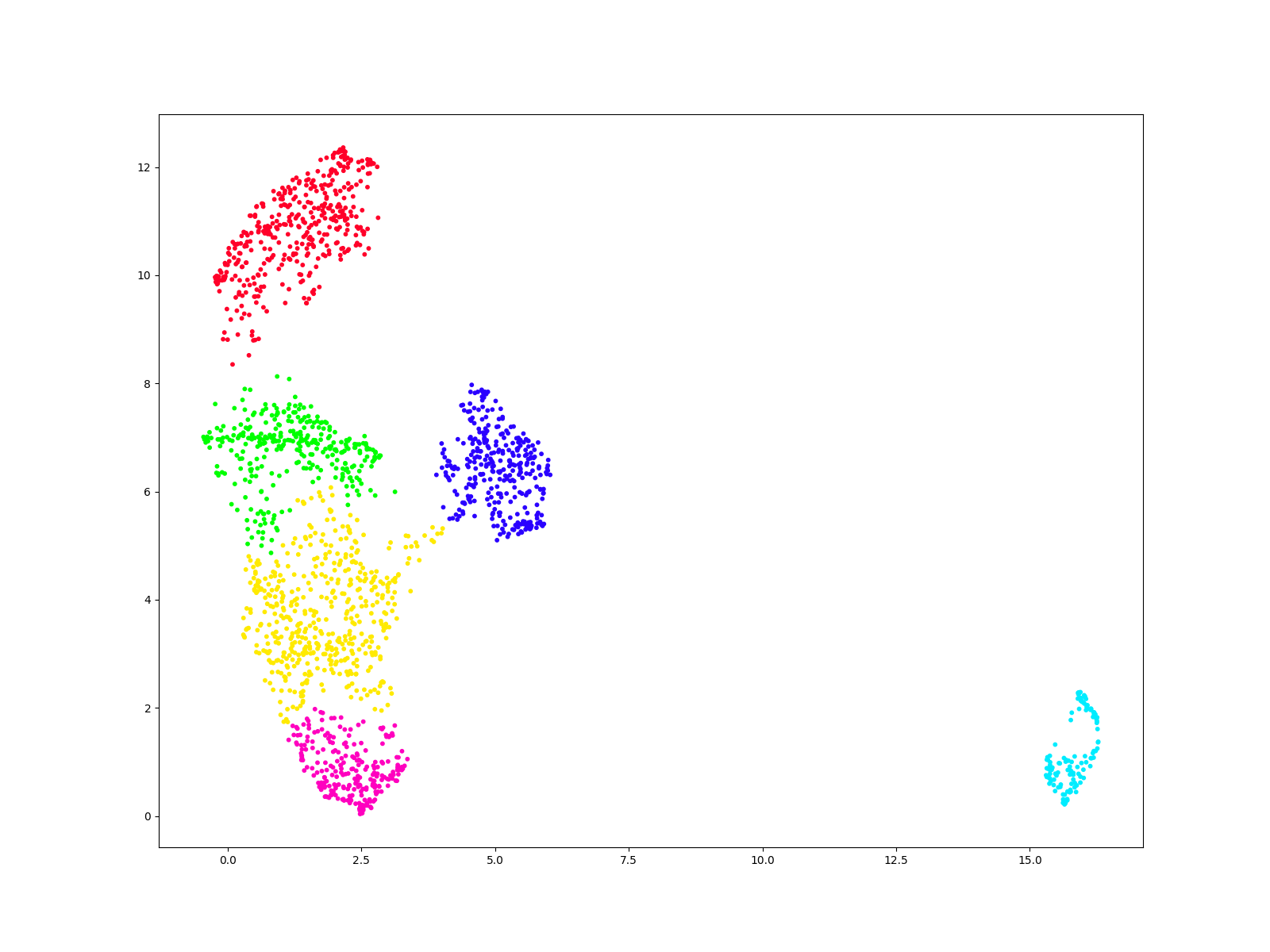
From the plot we claim that there are 6 clusters. We use hierarchical clustering (Ward method) to predict which points belong to which cluster. Then, we plot the result of the clustering.
from sklearn.cluster import AgglomerativeClustering
#declare object
scan = AgglomerativeClustering(n_clusters=6)
#make predictions
labels = scan.fit_predict(comps)
fig, ax = plt.subplots(figsize = (16,12))
ax.scatter(comps[:, 0], comps[:, 1], c=labels, s=10, cmap='gist_rainbow');
plt.show()
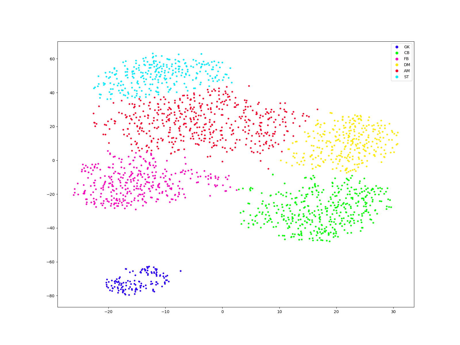
Labelling clusters
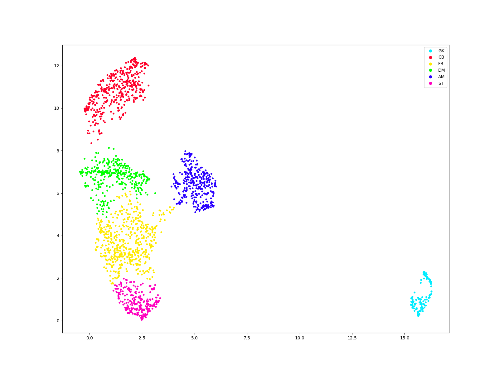
To label the clusters, we saved predcitins together with player names. Looking for many characteristic players, we label them in 6 formations - goalkeepers, centre-backs, full-backs, defensive midfielders, attacking midfielders and strikers.
#explore the dataframe
see = data.iloc[:, 0:5]
see["label"] = labels
print(see.sample(frac = 1).head(10))

#plot predictions with a legend
fig, ax = plt.subplots(figsize = (16,12))
scatter = ax.scatter(comps[:, 0], comps[:, 1], c=labels, s=10, cmap='gist_rainbow');
handles = scatter.legend_elements()[0]
#order the labels for hierarchy
myorder = [3,0,1,2,4,5]
handles = [handles[i] for i in myorder]
#add legend
ax.legend(handles=handles, labels = ["GK", "CB", "FB", "DM", "AM", "ST"])
plt.show()
                   Player  Nation    Pos       Squad           Comp  label
1215        Kevin Volland  de GER  FW,MF      Monaco     fr Ligue 1      5
1197  Stephan El Shaarawy  it ITA  FW,MF        Roma     it Serie A      1
719                 Chema  es ESP  DF,MF      Getafe     es La Liga      0
1437       Marc Cucurella  es ESP     MF      Getafe     es La Liga      1
404          Pablo Maffeo  es ESP     DF      Huesca     es La Liga      4
1710  Aurélien Tchouaméni  fr FRA     MF      Monaco     fr Ligue 1      2
1878          Rade Krunić  ba BIH  MF,FW       Milan     it Serie A      1
994          Manu Vallejo  es ESP     FW    Valencia     es La Liga      5
767       Ludovic Ajorque  re REU     FW  Strasbourg     fr Ligue 1      5
356          Lukas Kübler  de GER     DF    Freiburg  de Bundesliga      4
A different approach to the same problem - dimensionality reduction
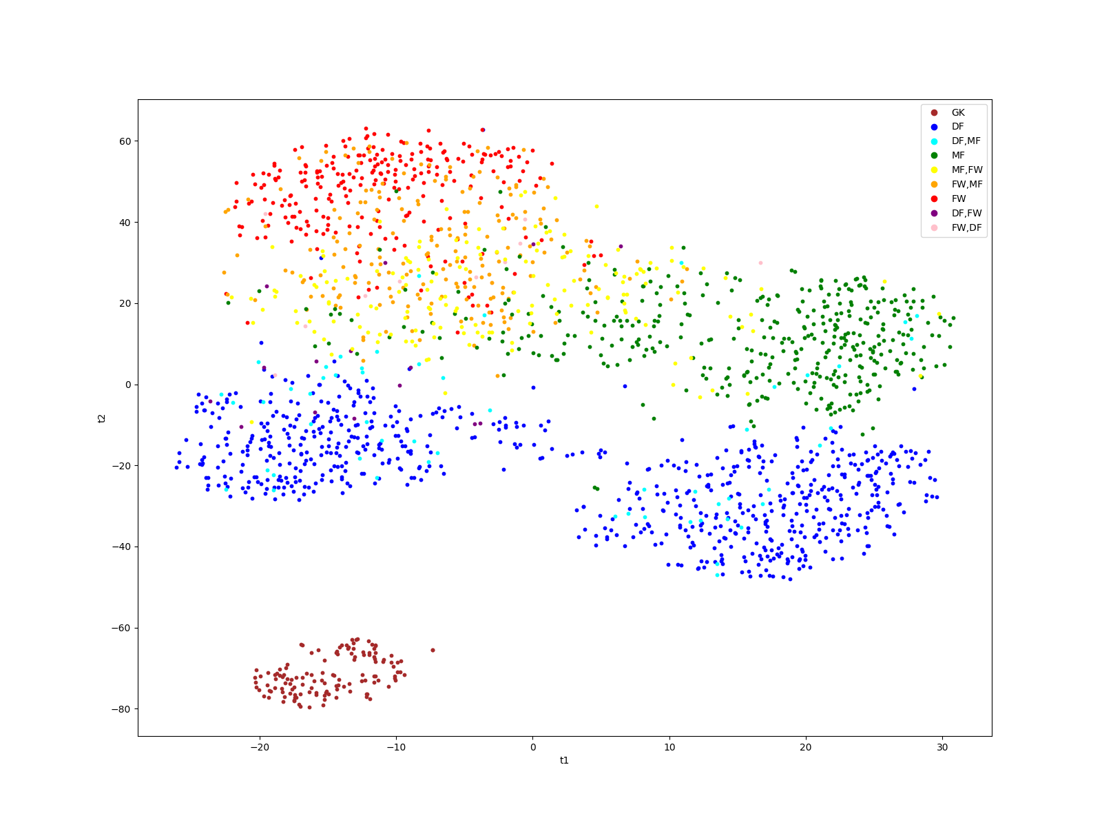
We can also approach this problem using different techniques. First, we reduce the dimensions using a pipeline of PCA and tSNE. We also plot it the same way we did it for UMAP.
from sklearn.decomposition import PCA
from sklearn.manifold import TSNE
from sklearn.pipeline import Pipeline
#declare dim reduction objects
pca = PCA()
tsne = TSNE(random_state = 3454)
#declare pipeline
ts = Pipeline([    ('pca', pca),
    ('tsne', tsne)
])
#reduce dimensions
comps = ts.fit_transform(X)
#plot it
fig, ax = plt.subplots(figsize = (16,12))
for i in range(X.shape[0]):
    ax.scatter(comps[i,0], comps[i,1], c = color_list[i], s = 10)
ax.set_xlabel('t1')
ax.set_ylabel('t2')
markers = [plt.Line2D([0,0],[0,0],color=color, marker='o', linestyle='') for color in colors.values()]
ax.legend(markers, colors.keys(), numpoints=1)
plt.show()
A different approach to the same problem - clustering
This time we cluster the data using Gaussian Mixture Model clustering. It is the same model as in Muller’s article. We also plot the predictions on the 2 dimensional space.
from sklearn.mixture import GaussianMixture
#declare object
gmm = GaussianMixture(n_components=6, random_state=5).fit(comps)
#make predictions
labels = gmm.predict(comps)
fig, ax = plt.subplots(figsize = (16,12))
plt.scatter(comps[:, 0], comps[:, 1], c=labels, s=10, cmap='gist_rainbow');
plt.show()
A different approach to the same problem - labelling
Here, we repeat steps we did previously to label the clusters. First, we investigate the dataframe with predictions, then, we plot our clusters with labels.
see = data.iloc[:, 0:5]
see["label"] = labels
print(see.sample(frac = 1).head(10))

#explore the dataframe
fig, ax = plt.subplots(figsize = (16,12))
scatter = ax.scatter(comps[:, 0], comps[:, 1], c=labels, s=10, cmap='gist_rainbow');
handles = scatter.legend_elements()[0]
#order the labels for hierarchy
myorder = [4,2,5,1,0,3]
handles = [handles[i] for i in myorder]
ax.legend(handles=handles, labels = ["GK", "CB", "FB", "DM", "AM", "ST"])
plt.show()
                  Player   Nation  ...                Comp label
674   Kyle Walker-Peters  eng ENG  ...  eng Premier League     5
1522        Jens Jønsson   dk DEN  ...          es La Liga     1
1770    Riccardo Improta   it ITA  ...          it Serie A     0
253      Darnell Furlong  eng ENG  ...  eng Premier League     5
1627   Exequiel Palacios   ar ARG  ...       de Bundesliga     1
1618          Mark Noble  eng ENG  ...  eng Premier League     1
378      Clément Lenglet   fr FRA  ...          es La Liga     2
1241     Andrea Consigli   it ITA  ...          it Serie A     4
1394        Fran Beltrán   es ESP  ...          es La Liga     1
1447      Kerem Demirbay   de GER  ...       de Bundesliga     0

[10 rows x 6 columns]
Total running time of the script: ( 0 minutes 33.940 seconds)