Visualising football
In this section we look at a variety of ways of analysing event data in football. Event data is everything that happens on the ball. It is sometimes supplemented with additional information, such as whether a pass is made under pressure, but the focus is very firmly on individual on-ball events: tackles, passes, shots, interceptions etc.
What we will learn now is how to create useful visualistions of this data. Start by watching the video!
It is the job of the mathematician to take a lot of complex data and boil it down to a simple but powerful idea. In football, the message needs to be even more direct. In the dressing room at half-time, with the team behind by two goals and unable to keep control of the ball, the manager has to be able to convey a plan quickly. Imagine what you would do in that situation? The manager is lost for ideas, and in a final act of desperation he turns to you, the mathematician, and asks, ‘Can you see the problem?’
We will maybe not be able to give half-time advice (not yet anyway) but we will learn ways to visualise the data in the way that helps coaching staff understand the game better.
Shot and pass maps
The Real Madrid side of 2014/15 were built around a talented midfield releasing balls to three explosive forwards: Cristiano Ronaldo, Karim Benzema and Gareth Bale. The figure below is a map of their shots during their 12 Champions League games that season.
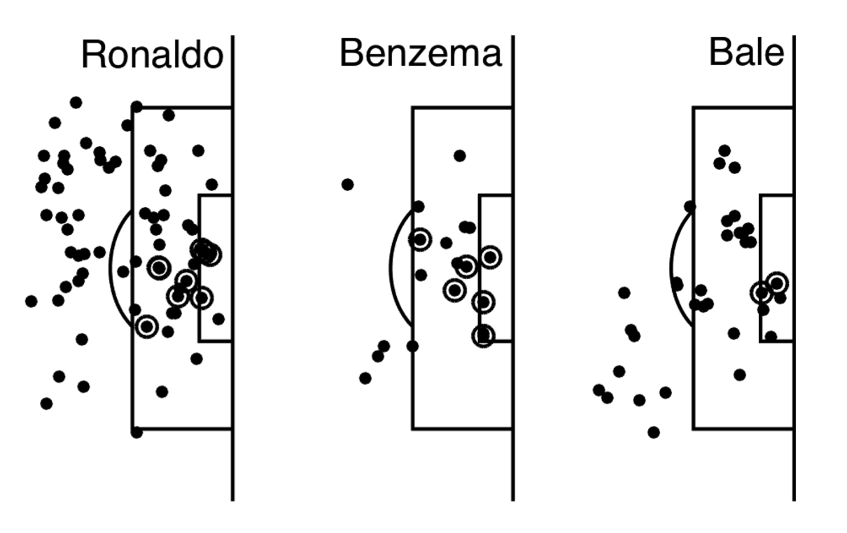
Ronaldo gets a lot of shots in during a game, and he makes them from everywhere in and around the box. Benzema has fewer shots but enjoys a much higher conversion rate than Ronaldo, scoring with almost half the shots he makes from inside the box (circled dots are goals in this data). In comparison, Ronaldo might look a bit wasteful: he took 35 shots from outside the box and didn’t score a single time! Bale, who was criticised by some Real fans and the Spanish media during the campaign for being greedy in front of goal, was reasonably cautious. Bale has a few clusters of points he likes to shoot from: outside the box on the right, left of the penalty spot and from near the right-hand post. Unfortunately for him, he only managed to score from the last of these positions.
Even in simple black and white, these maps characterise the difference between players.
Pass maps have a start an end point, where the pass came from and where it ends up. I found these pass maps particularly interesting during Liverpool’s 2019-20 season. They show the most dangerous passes produced by their left and right backs.
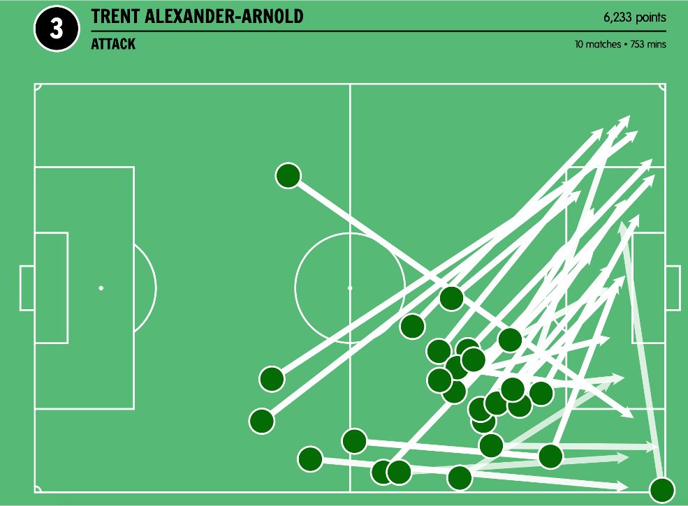
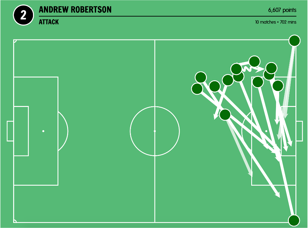
These visuals captured very well how these Alexander-Arnold and Robertson contributed to attacking play: Alexander-Arnold often passed early to Roberston, switching the direction of play. Robertson, for his part would pass to the other side, finding Salah or Firmino.
Now go in to plotting shots and learn how to make plots like this yourself.
Passing networks
A passing network can really tell the story of a game. One of the first I ever created was this one from Italy vs England in Euros 2012.
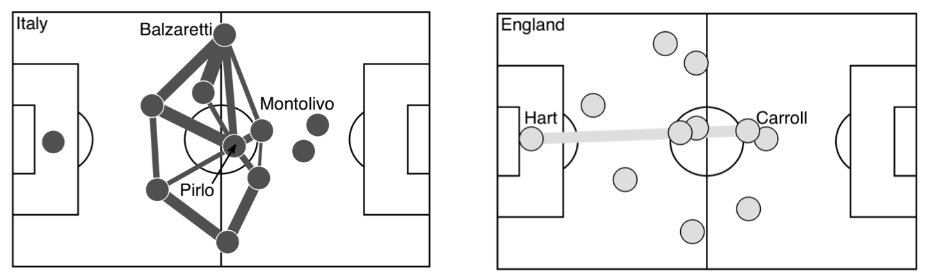
Each point represents a player. A link between pairs of players indicates that they made 13 or more successful passes to each other during the match. Thicker lines indicate a higher number of passes. It’s immediately clear that Italy made a lot more successful passes than England. The focus was Andrea Pirlo.He dispatched the ball successfully 115 times, orchestrating most of the Italian attacks. England tried to get the ball to Wayne Rooney, playing longer balls towards him down the middle, or by crossing to him from the wings. As the match progressed, England’s approach became even more direct. On 60 minutes, Andy Carroll came on. At 1.93m (6’4) he was the tallest out- field player, and controlled the airspace in the centre. Once he had recovered the ball after each of the many Italian attacks, Joe Hart kicked it directly up to Carroll (see bottom panel in Figure 7.1). It’s quite impressive that Carroll managed to win the ball so many times from Hart’s kicks. Despite being on the pitch only half as long as most of the other players, he was one end of England’s most successful passing partnership. But Hart and Carroll’s success reveals failures elsewhere. England had no consistent passing network in midfield. Instead, the Italians dominated the match, with 68% of possession and 36 shots. Italy passed the ball forward and England tried to kick it over their heads.
A more recent example, of a similar sort of playing style of focussing on one attacking player can be seen in Denmark’s 2022 Euros quarter finals game against Spain.
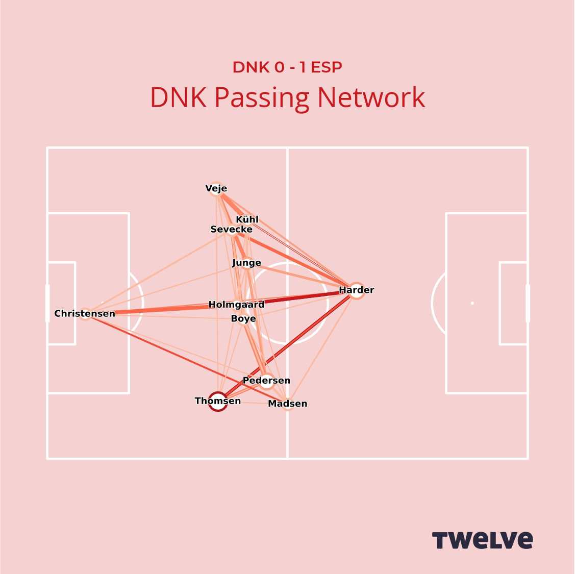
Although Denmark lost this game, they had a clear strategy against the high-possession team Spain: get the ball to Pernille Harder. In the end the goal never came for her, but Denmark came close several times.
Now go in to passing networks and make these networks yourself.
Heat maps
Let’s look again at th 2014/15 Real Mardid side. In the period leading up to a shot, the ball typically moves around a lot as the attacking team tries to find a way through the defence. By marking every point at which the ball was played just before each of the Real Madrid shots during the Champions League season, we can get an overall picture of how they create successful attacks. The plot below is a risk map showing where the ball was played in the 15 seconds leading up to a shot from the 20m by 20m area in front of goal.
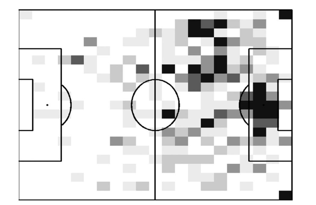
The darker areas show places where there is a high risk of a Real Madrid shot from the danger zone coming within the next 15 seconds; the lighter areas show places where the risk is low. Corners are one clear risk-zone and, not surprisingly, if the ball is already in the box then the risk of a shot is high. But the most interesting risk zone is the hot area outside the box on Real Madrid’s left. This area of the pitch is mainly occupied by Marcelo, who comes up on the left wing, and Ronaldo, who is more central. It is from here that dangerous chances are created.
The 15-second window brings context to the touches made by Ronaldo. In the video lecture above I look at another touch map, which does not give context, just a smoothed out map of passes. These tend to be less informative, simply because not all touches are as dangerous in football.
So far we have concentrated on passes, but a similar approach can be taken to all actions. The plot below shows a measurement of defensive actions per pass by the opposition in the Championship. This was the season before Leeds won promotion, but we see clearly here how much pressing they do.
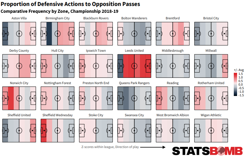
Several important adjustments are made in this heatmap. Firstly, it is defensive actions per pass, instead of total defensive actions. This adjustment is made because if a team is only defending then it will, logically, perform more defensive actions. Only defending is generally not good, so the adjustment thus corrects for how much time the opposition have the ball. The second adjustment, is the use of a Z-score in the colour bar instead of a count of actions. This means that we measure the team performance relative to the league: Leeds carry out alot of defensive actions statistically than other teams. We will return to statistical anlyses in lesson 2
The Statsbomb article , from which this image is taken, gives a good account of Leed’s season and their pressing, in particular. Their webpage is a good source for learning more about how visualisations like this are applied.
Key Performance Indices (KPI)
It is important for clubs to develop a culture around Key Performance Indices (KPIs). These should be set by the coaching staff, working together with data scientists and the clubs management, to find aspects of the team’s style of play that is measureable and can be communicated throughout the club.
Below are a few examples of visualisations of KPIs for Liverpool’s last ten games in the Premier League season 2021-22 using the twelve.football platform. These are measured over 10 matches (the last 10 of the season). Usually measurements between six and ten matches gives a reliable idea of form. We develop KPIs with clubs to match their style of play.
Expected Goals
The first visualisation is a shot map and a report on expected goals over ten matches.
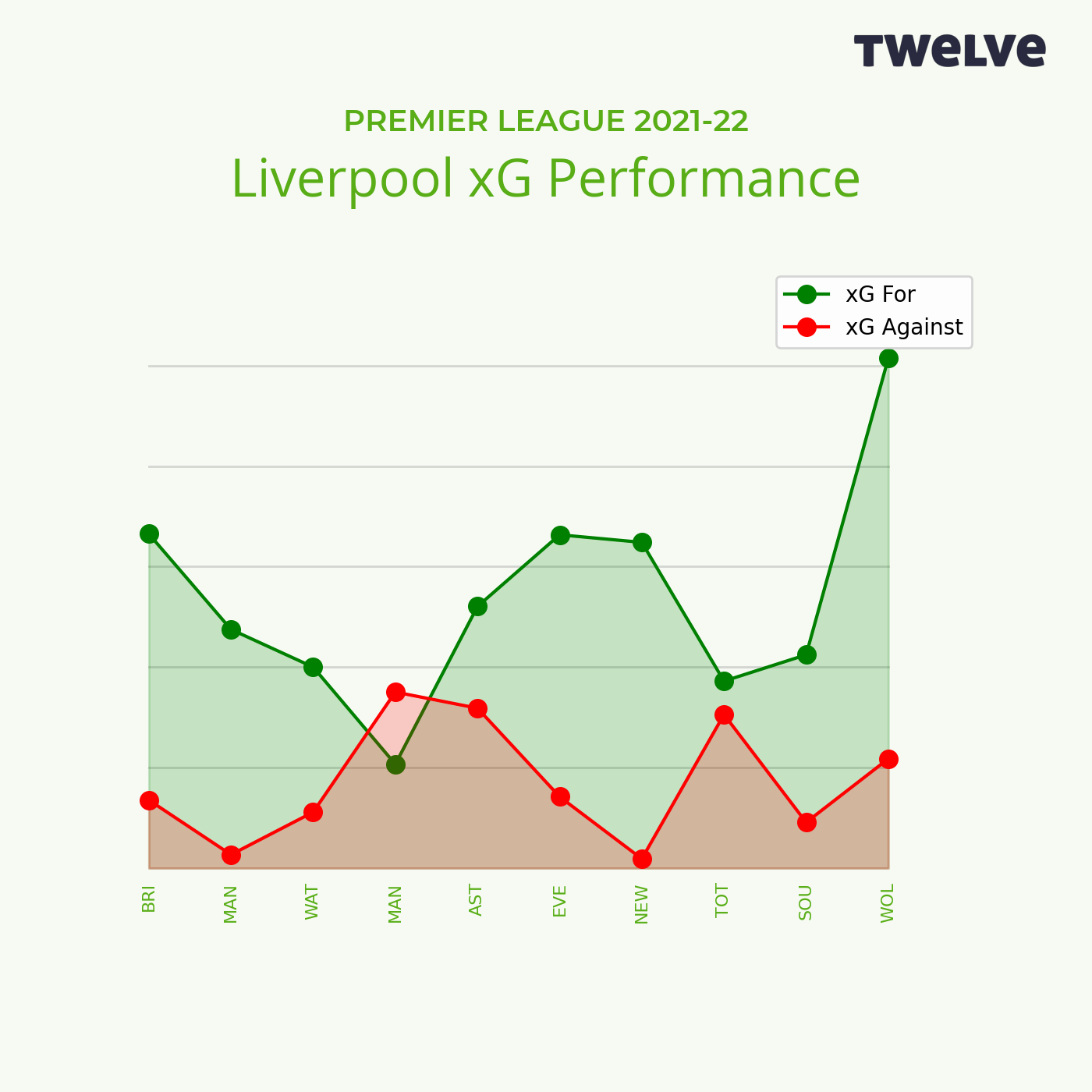
We will cover expected goals in the next section, but for now you can think of the size (area) of the shot dots as measuring the quality of a chance. Notice that Liverpool mainly shoot from an area in the middle of the penalty area. They aim to create high quality chances. Their xG performance is presented as a rolling expected goal difference for each match. This shows they created better chances than their opponents in all but one of their matches (against Manchester City).
Entries in to the final third
Again building on expected goals, this visualisation shows the quality of chances Liverpool had when they entered the final third, broken down based on entry point.
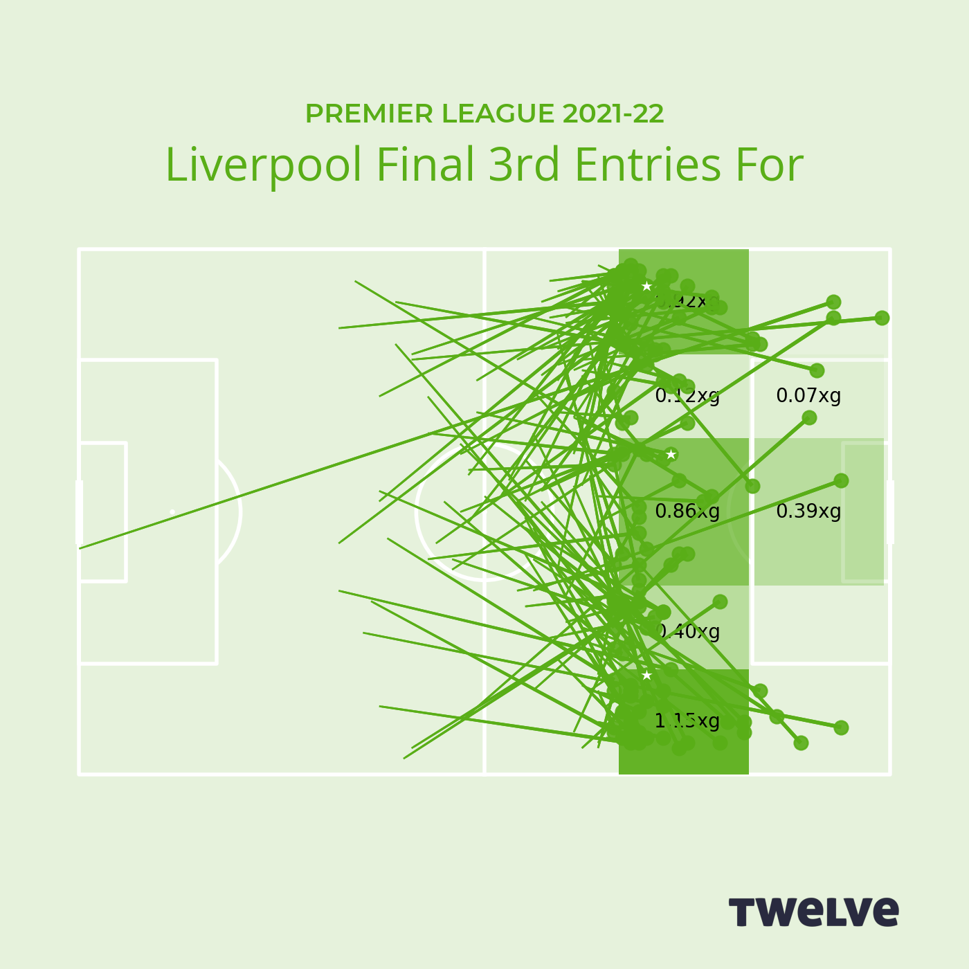
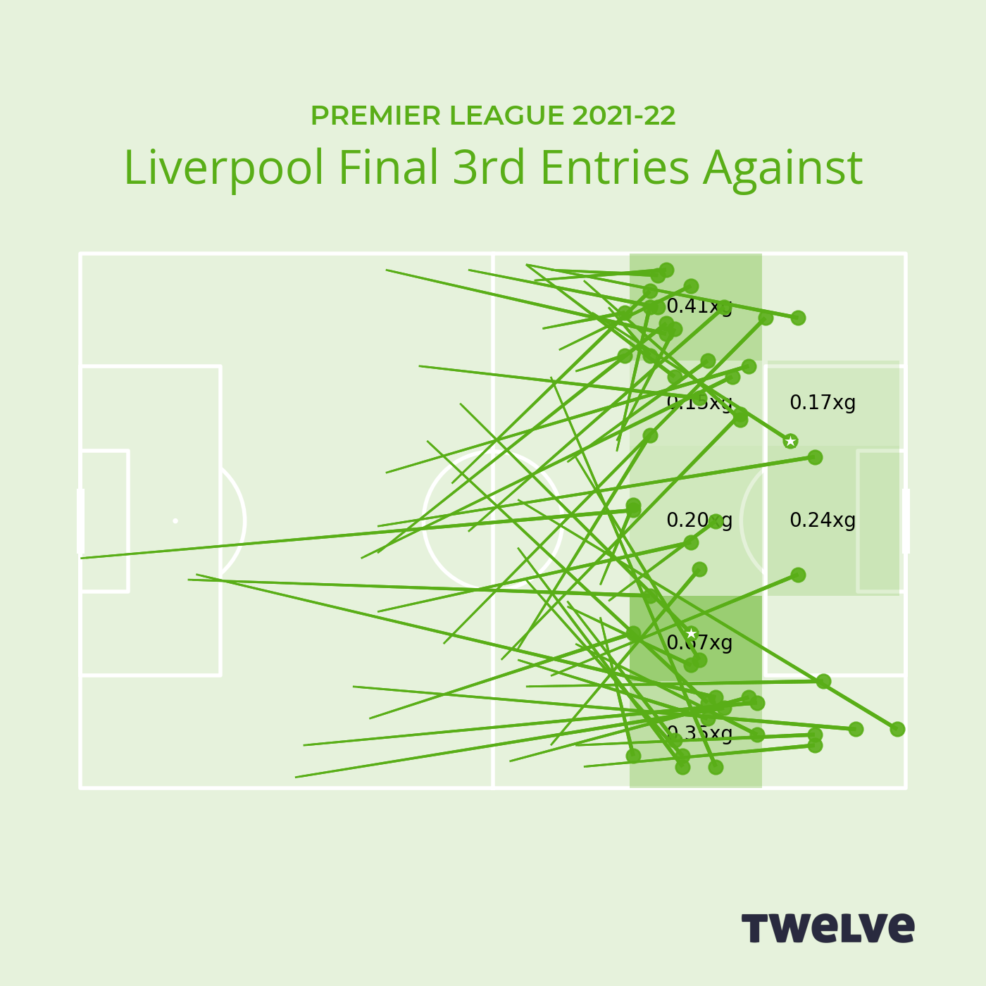
Notice that balls arriving first on the wings (to Salah and Alexander-Arnold on the right, and Mane and Robertson on the left) are most dangerous. Centrally, they are less of a risk. Turning to the entries against we see (of course) that their opponents enter Liverpool’s final third less often, but are slightly more dangerous when attacking on the right.
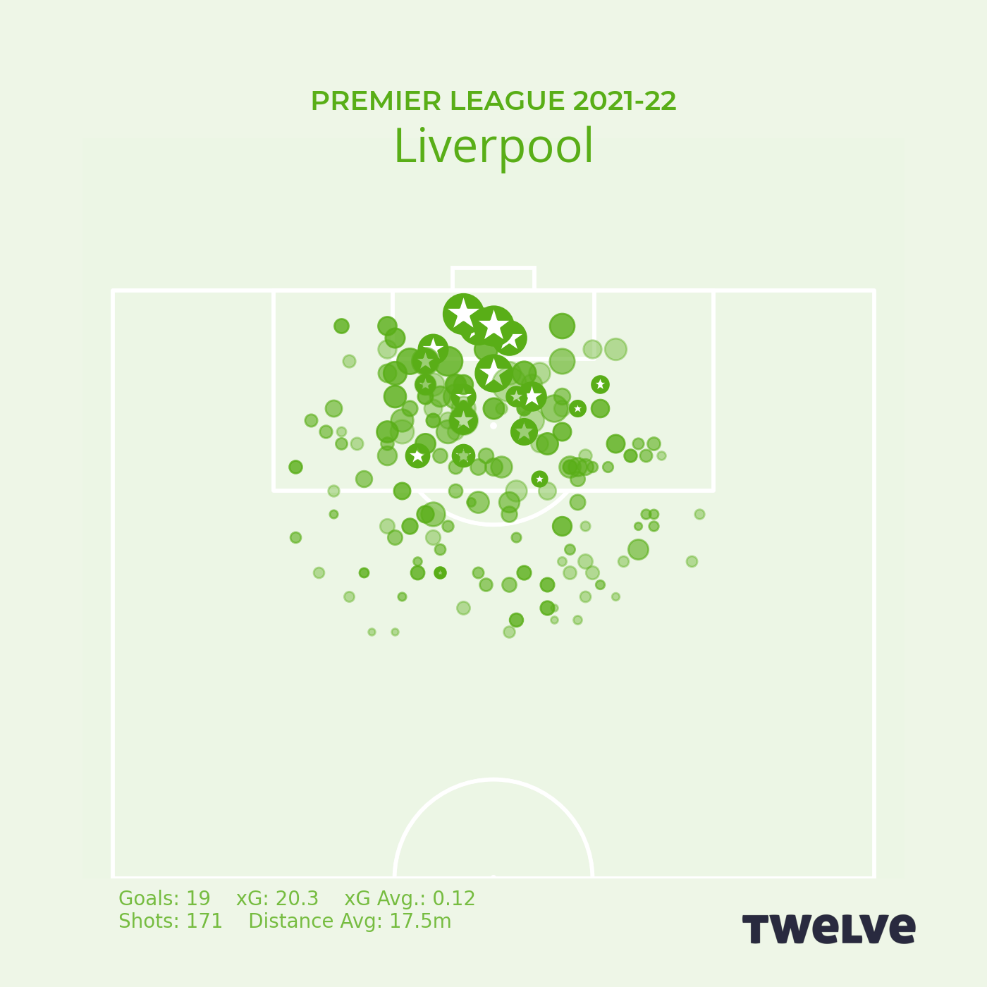
Transitions
An important part of Liverpool’s game is pressing high up the field, regaining the ball and creating chances from this. The map on the left shows where they are making these regains and the quality of the chance they generate. Again, area of the circle is quality of chance and a star indicates a goal. Slightly more of these successful regains occur on Liverpool’s left wing than on the right. A striking aspect is how well they convert regains in their own half in to successful attacks.
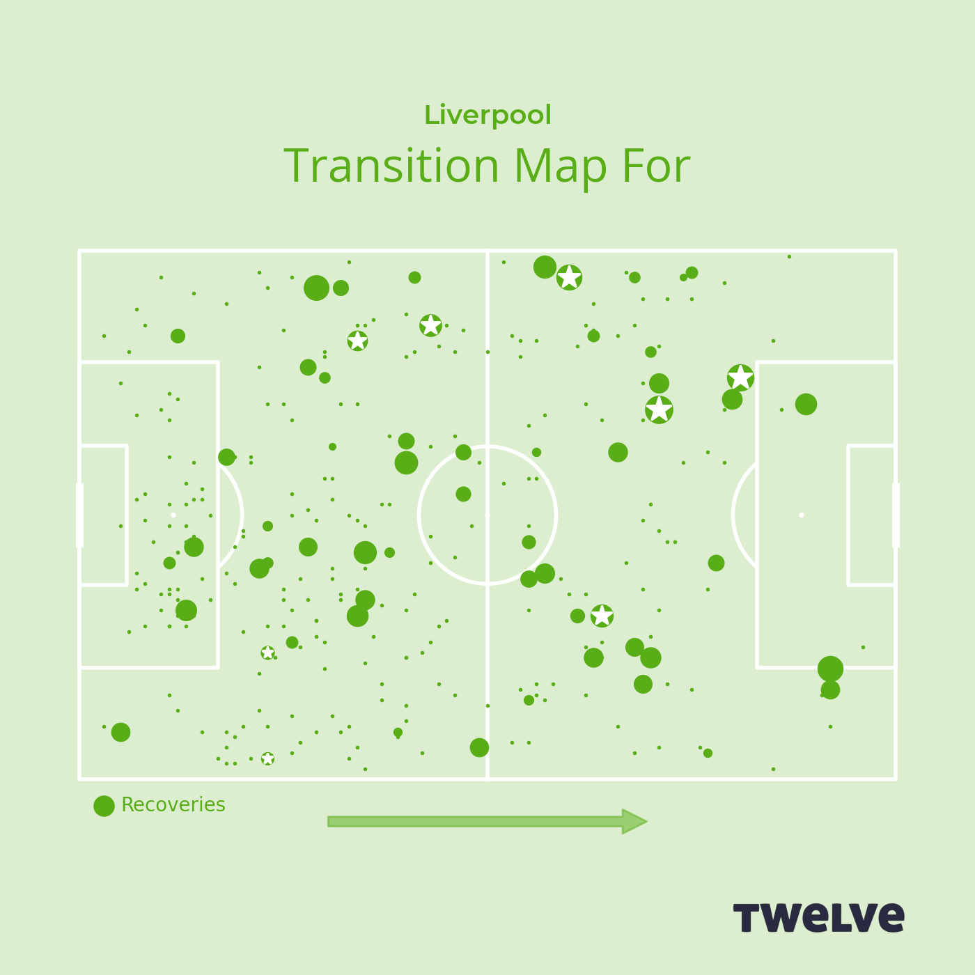
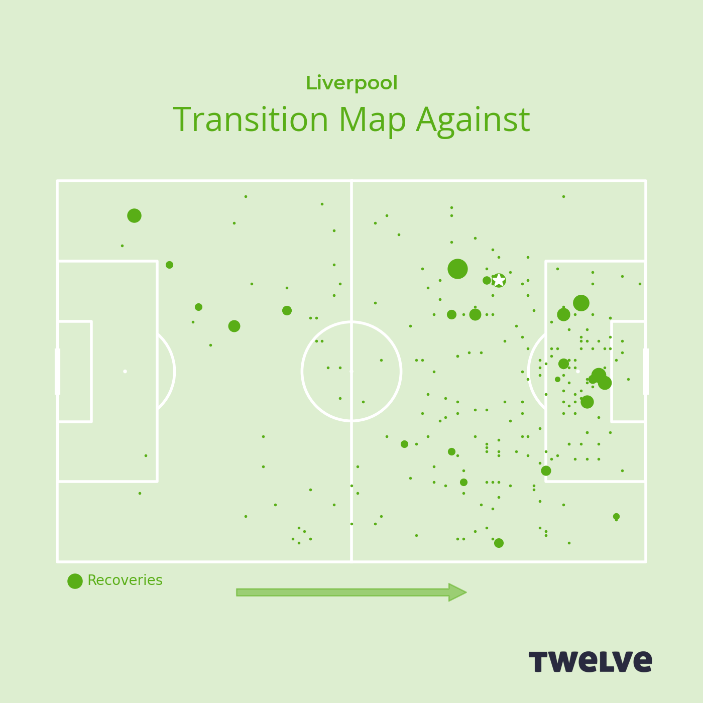
Turning to the map on the right, we see that although other teams do regain the ball from Liverpool while they are attacking, they seldom create danger from these regains. It is appears to be extremely difficult to win the ball back from Liverpool in their half of the pitch!
Further Reading
Soccermatics, Chapter 7, The Tactical Map.